Gumroad Mobile App Redesign

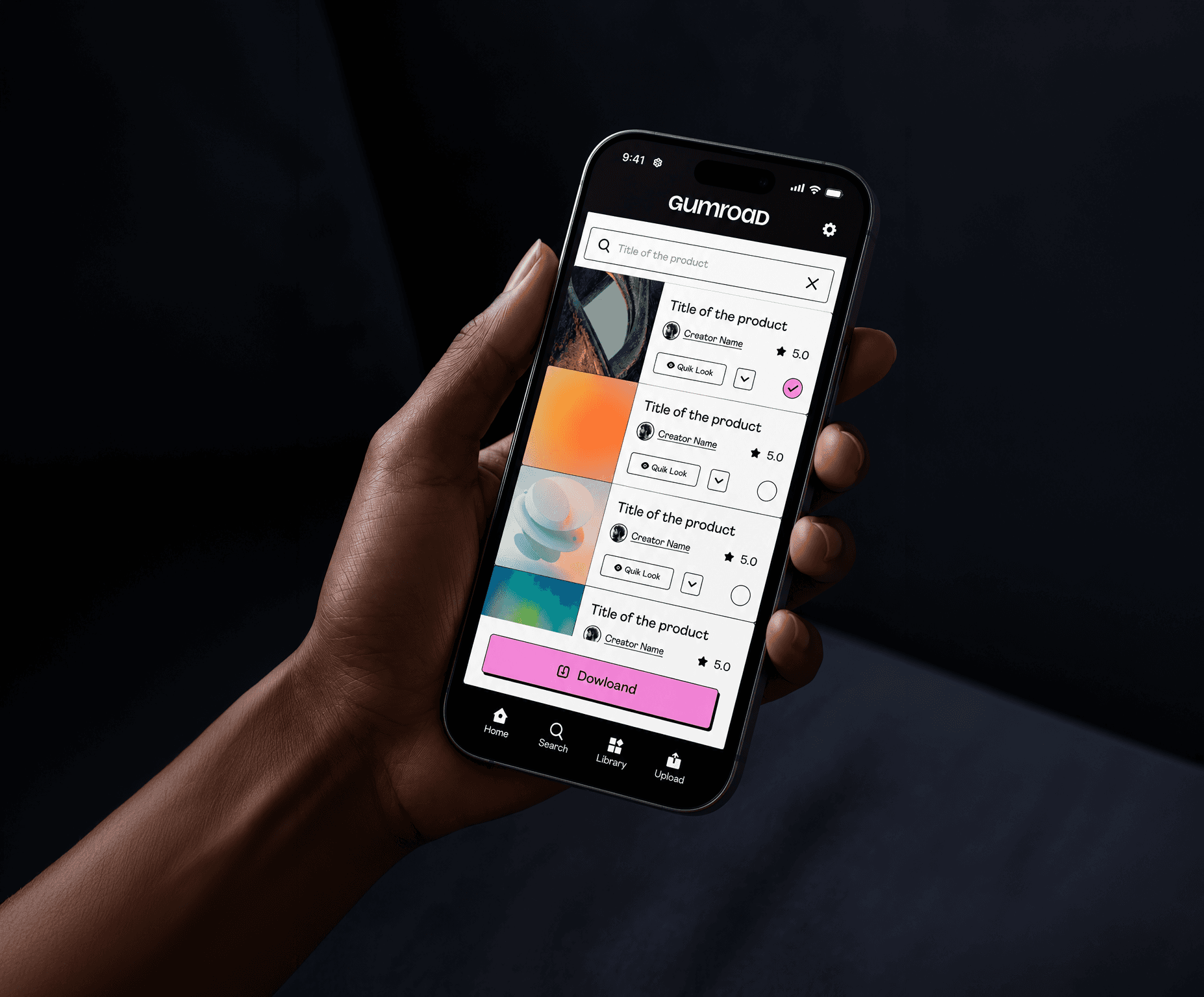
Gumroad is a platform where creators sell digital products directly to their audience. A Nielsen Heuristics audit of the iOS app revealed six distinct violations across navigation, search, library, and download flows. This case study documents the redesign of five screens and the addition of two net-new surfaces, each grounded in a specific usability failure.

00
research

The methodology was expert review systematic, not impressionistic. Each screen of the live Gumroad iOS app was evaluated against Nielsen's 10 usability heuristics, used not as a checklist but as a diagnostic lens.

The methodology was expert review systematic, not impressionistic. Each screen of the live Gumroad iOS app was evaluated against Nielsen's 10 usability heuristics, used not as a checklist but as a diagnostic lens.

The methodology was expert review systematic, not impressionistic. Each screen of the live Gumroad iOS app was evaluated against Nielsen's 10 usability heuristics, used not as a checklist but as a diagnostic lens.

key insights

The download flow communicated nothing. Tapping a product opened a near-empty screen. No size, no format, no context. Users were expected to download blind. There was no navigation system. The app's top-left logo was tappable but led nowhere. Seller tools had no dedicated entry point. Every screen was a one-way door. Tap in, complete one action, go back. No multi-select, no batching, no way to act on a list. The app was designed for one product at a time in a world where users owned dozens. Every problem had the same root: the interface expected users to remember, not recognize.

The download flow communicated nothing. Tapping a product opened a near-empty screen. No size, no format, no context. Users were expected to download blind. There was no navigation system. The app's top-left logo was tappable but led nowhere. Seller tools had no dedicated entry point. Every screen was a one-way door. Tap in, complete one action, go back. No multi-select, no batching, no way to act on a list. The app was designed for one product at a time in a world where users owned dozens. Every problem had the same root: the interface expected users to remember, not recognize.

The download flow communicated nothing. Tapping a product opened a near-empty screen. No size, no format, no context. Users were expected to download blind. There was no navigation system. The app's top-left logo was tappable but led nowhere. Seller tools had no dedicated entry point. Every screen was a one-way door. Tap in, complete one action, go back. No multi-select, no batching, no way to act on a list. The app was designed for one product at a time in a world where users owned dozens. Every problem had the same root: the interface expected users to remember, not recognize.

year

2026

timeframe

7 days

tools

Figma · 10 Usability Heuristic

category

UI

01

02

03

04

.say hello

Let's talk. Whether it's a project, a question, or a collaboration, I'm always up for a good brief.

.say hello

Let's talk. Whether it's a project, a question, or a collaboration, I'm always up for a good brief.